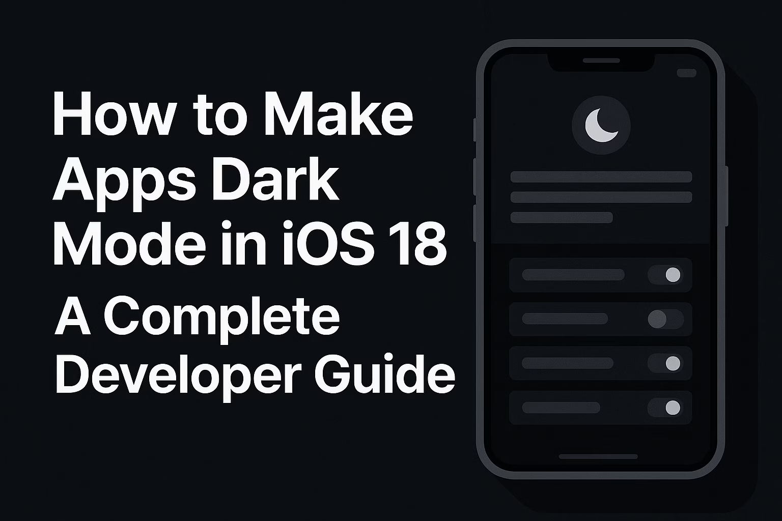
Dark mode in iOS 18 isn’t just a trendy feature anymore; it’s an essential part of modern iOS app development. With iOS 18, Apple has taken dark mode customization to unprecedented levels, introducing new capabilities that allow both app icons and interfaces to seamlessly adapt to user preferences. If you’re an iOS developer looking to implement dark mode in your apps, this comprehensive guide will walk you through everything you need to know.
What’s New in iOS 18 Dark Mode?
iOS 18 represents the most significant evolution in dark mode functionality since its introduction in iOS 13. The update extends dark mode to home screen app icons, automatically giving them a dark or black tint when dark mode is enabled. The OS automatically detects icon colors and applies dark effects without hiding the actual logo or branding.
Key iOS 18 Dark Mode Features:
- Automatic Icon Adaptation: All app icons get color changes to better fit dark mode, with the system automatically detecting icon colors and applying appropriate dark effects
- Tinted Mode: Users can apply custom color tints across all app icons
- Dynamic Wallpapers: Wallpaper hues shift multiple times during the day
- Enhanced Customization: Users can independently toggle dark icons without enabling system-wide dark mode
Why Dark Mode Matters for Your iOS 18 App
Before diving into implementation, let’s understand why dark mode is crucial:
User Experience: Many users prefer dark interfaces, especially at night or in low-light conditions, as dark mode reduces eye strain
Battery Efficiency: Dark UIs consume less power on OLED screens, extending battery life
Competitive Advantage: Apps without optimized dark mode icons can look like stains on users’ carefully customized home screens, potentially driving them to competitors
Accessibility: Some users with visual sensitivity find dark interfaces more comfortable
Implementing Dark Mode in SwiftUI (iOS 18)
SwiftUI was designed with dynamic theming in mind, making dark mode implementation straightforward. Here’s how to implement it effectively:
1. Basic Automatic Dark Mode Support
The simplest implementation requires minimal code. SwiftUI’s default color system automatically adapts to the user’s appearance settings. Use semantic colors:
import SwiftUI

struct ContentView: View {
    var body: some View {
        VStack {
            Text("Hello, Dark Mode!")
                .foregroundColor(.primary)  // Automatically adapts

            Rectangle()
                .fill(Color(.systemBackground))  // Adaptive background
        }
    }
}
2. Detecting Current Color Scheme
SwiftUI lets you detect whether dark mode or light mode is currently enabled using the colorScheme environment key:
struct AdaptiveView: View {
    @Environment(\.colorScheme) var colorScheme

    var body: some View {
        Text(colorScheme == .dark ? "Dark mode active" : "Light mode active")
            .foregroundColor(colorScheme == .dark ? .white : .black)
    }
}
3. Creating Custom Adaptive Colors
For custom colors that need to adapt to dark mode, use color assets in your asset catalog:
// In your asset catalog, create a color set with:
// - Any Appearance: #007AFF (blue)
// - Dark Appearance: #0A84FF (lighter blue)

struct CustomColorView: View {
    var body: some View {
        Text("Custom Adaptive Color")
            .foregroundColor(Color("CustomBlue"))
    }
}
4. Programmatic Color Definition
You can define semantic colors programmatically without using asset catalogs:
extension Color {
    static func adaptiveColor(light: Color, dark: Color) -> Color {
        return Color(UIColor { traitCollection in
            switch traitCollection.userInterfaceStyle {
            case .dark:
                return UIColor(dark)
            default:
                return UIColor(light)
            }
        })
    }
}

// Usage
Text("Adaptive Text")
    .foregroundColor(.adaptiveColor(light: .blue, dark: .orange))
5. Adding a Dark Mode Toggle
You can create a toggle switch that allows users to manually switch between light and dark modes:
struct DarkModeToggleView: View {
    @State private var isDarkMode = false
    @Environment(\.colorScheme) var colorScheme

    var body: some View {
        VStack(spacing: 20) {
            Text("Dark Mode Settings")
                .font(.largeTitle)
                .fontWeight(.bold)

            Image(systemName: isDarkMode ? "moon.fill" : "sun.max.fill")
                .resizable()
                .scaledToFit()
                .frame(width: 100, height: 100)
                .foregroundColor(isDarkMode ? .yellow : .orange)

            Toggle(isOn: $isDarkMode) {
                Text(isDarkMode ? "Dark Mode" : "Light Mode")
                    .font(.headline)
            }
            .padding()
        }
        .preferredColorScheme(isDarkMode ? .dark : .light)
    }
}
6. Forcing Dark or Light Mode
To override appearance for specific views, use the preferredColorScheme modifier:
// Force dark mode for entire app
struct MyApp: App {
    var body: some Scene {
        WindowGroup {
            ContentView()
                .preferredColorScheme(.dark)
        }
    }
}

// Force light mode for specific view
struct LightOnlyView: View {
    var body: some View {
        Text("Always Light")
            .preferredColorScheme(.light)
    }
}

// Follow system setting
.preferredColorScheme(nil)  // This is the default
Creating Dark Mode App Icons for iOS 18
One of the most significant iOS 18 features is the ability to provide custom dark and tinted app icons. Here’s how to implement them:
Using Xcode 16 (Recommended Method)
The simplest solution is to upgrade to Xcode 16:
- Select your app icon in the Asset Catalog
- Go to View > Inspector > Attributes
- In the iOS dropdown, select Single Size
- In Appearance, select Any, Dark, or Tinted
- Add your dark and tinted icon versions to the newly appeared slots
Manual Method (Xcode 15)
If you’re using Xcode 15, you can manually edit the Contents.json file in your asset catalog:
{
  "images" : [
    {
      "idiom" : "universal",
      "platform" : "ios",
      "size" : "1024x1024"
    },
    {
      "appearances" : [
        {
          "appearance" : "luminosity",
          "value" : "dark"
        }
      ],
      "idiom" : "universal",
      "platform" : "ios",
      "size" : "1024x1024"
    },
    {
      "appearances" : [
        {
          "appearance" : "luminosity",
          "value" : "tinted"
        }
      ],
      "idiom" : "universal",
      "platform" : "ios",
      "size" : "1024x1024"
    }
  ],
  "info" : {
    "author" : "xcode",
    "version" : 1
  }
}
Design Guidelines for Dark Icons
Dark icons are redesigned with a black background rather than white or colored backgrounds, making them blend better with dark mode:
- Use a dark or black background for the dark variant
- Ensure logos remain visible and recognizable
- Maintain brand identity while adapting to dark aesthetics
- Test icons against various wallpapers
What Happens If You Don’t Provide Dark Icons?
iOS 18 automatically applies dark mode to unoptimized third-party app icons by detecting icon colors and applying dark effects. The system uses clever mathematical calculations, not AI, to extract the foreground and determine whether it should be tinted with the background color or left as-is.
However, relying on automatic conversion risks losing control over your branding, or your app could appear as a visual inconsistency on users’ home screens.
Best Practices for Dark Mode Implementation
1. Use Semantic Colors
Always prefer semantic colors over hardcoded values:
// ✅ Good - Automatically adapts
.foregroundColor(.primary)
.background(Color(.systemBackground))

// ❌ Bad - Won't adapt
.foregroundColor(.black)
.background(.white)
2. Test in Both Modes
Enable easy testing by adding a dark mode toggle to your debug settings:
#if DEBUG
struct ContentView_Previews: PreviewProvider {
    static var previews: some View {
        Group {
            ContentView()
                .preferredColorScheme(.light)
                .previewDisplayName("Light Mode")

            ContentView()
                .preferredColorScheme(.dark)
                .previewDisplayName("Dark Mode")
        }
    }
}
#endif
3. Ensure Sufficient Contrast
Always test your color combinations for readability:
- Light text on dark backgrounds needs sufficient contrast
- Avoid pure white (#FFFFFF) on pure black (#000000) – it’s too harsh
- Use slightly off-white and off-black colors for better readability
// Better contrast colors
let darkBackground = Color(red: 0.11, green: 0.11, blue: 0.12) // #1C1C1E
let lightText = Color(red: 0.92, green: 0.92, blue: 0.96) // #EBEBF5
4. Handle Images Properly
Create separate image assets for light and dark modes:
Image("logo") // Automatically uses logo-dark variant in dark mode
In your asset catalog:
- Add an image set
- Set Appearances to “Any, Dark”
- Provide both light and dark versions
5. Respect User Preferences
It’s generally recommended to respect the user’s system-wide appearance settings rather than forcing a specific mode unless there’s a compelling reason.
Testing Dark Mode in iOS 18
Navigate to the Developer page in the Settings app on your simulator and turn on the switch for Dark Appearance. On a real device, you can enable it from Display & Brightness settings.
Quick Testing Tips:
- Control Center Toggle: Add dark mode toggle to Control Center for quick switching during development
- Xcode Interface Builder: Set appearance in Storyboard preview
- Environment Overrides: Use Xcode’s Environment Overrides feature while debugging
- SwiftUI Previews: Test both modes simultaneously in preview canvas
Common Dark Mode Issues and Solutions
Issue 1: Hardcoded Colors Don’t Adapt
Problem: Colors remain the same in both modes
Solution: Replace hardcoded colors with semantic colors or adaptive color assets
Issue 2: Poor Contrast in Dark Mode
Problem: Text is difficult to read in dark mode
Solution: Use higher contrast colors and test with accessibility settings enabled
Issue 3: Images Look Wrong in Dark Mode
Problem: Images designed for light backgrounds look bad on dark backgrounds
Solution: Provide separate image assets for dark mode or use template rendering mode
Image(systemName: "star.fill")
    .renderingMode(.template)
    .foregroundColor(.adaptiveColor(light: .blue, dark: .cyan))
Issue 4: Mixed Content from Different Developers
When using dark mode, some apps from developers who haven’t optimized their icons retain white backgrounds. As a developer, ensure your app icons are properly optimized to avoid this issue.
How Users Enable Dark Mode Icons in iOS 18
To change app icon colors in iOS 18, users need to press and hold the home screen, tap Edit, select Customize, and choose between Dark, Light, or Automatic modes:
- Press and hold on the Home Screen
- Tap Edit in the top-left corner
- Select Customize
- Choose Dark, Light, or Automatic
- Tap outside to save
Users can enable dark icons independently of system dark mode, allowing light mode with dark icons if preferred.
UIKit Implementation (For Legacy Code)
If you’re working with UIKit, here’s how to implement dark mode:
// Detect current interface style
override func traitCollectionDidChange(_ previousTraitCollection: UITraitCollection?) {
    super.traitCollectionDidChange(previousTraitCollection)

    if traitCollection.hasDifferentColorAppearance(comparedTo: previousTraitCollection) {
        // Update colors when appearance changes
        updateColors()
    }
}

// Force dark mode for entire app
UIApplication.shared.windows.forEach { window in
    window.overrideUserInterfaceStyle = .dark
}

// Use dynamic colors
let label = UILabel()
label.textColor = UIColor.label  // Automatically adapts
label.backgroundColor = UIColor.systemBackground
Disabling Dark Mode (When Necessary)
If you need to temporarily disable dark mode for your app, add this to your Info.plist:
<key>UIUserInterfaceStyle</key>
<string>Light</string>
However, this should only be done if you have an existing app and don’t have time to implement dark mode changes properly. It’s better to support dark mode for improved user experience.
Conclusion
Dark mode in iOS 18 is more than just inverting colors—it’s about creating a cohesive, comfortable user experience that adapts to user preferences and environmental conditions. As an iOS developer, implementing a polished dark mode experience signals that your app is current and user-focused.
By following this guide, you’ll be able to:
- Implement automatic dark mode support in SwiftUI
- Create custom adaptive colors for your brand
- Provide optimized dark and tinted app icons
- Handle edge cases and ensure accessibility
- Test your implementation thoroughly
Remember: Dark mode is a big trend and good user experience to offer in your SwiftUI application. With iOS 18’s enhanced customization options, users expect apps to seamlessly adapt to their chosen appearance. Don’t let your app fall behind—implement dark mode support today and give your users the polished experience they deserve.
Additional Resources
- Apple Human Interface Guidelines – Dark Mode
- SwiftUI Documentation – Color Scheme
- WWDC 2024 Session Videos
- iOS 18 Developer Documentation
Ready to make your iOS 18 app shine in both light and dark modes? Start implementing these techniques today and watch your user satisfaction soar!